Njama ya Waterfall (Njama ya Kumbusha) ni nini?


A waterfall plot, pia inayoitwa njama ya kumbusha, ni grafu ya pande tatu inayoonyesha jinsi mvutano spectrum unavyobadilika kwa wakati au kwa kutofautiana kwa nyingine — mara nyingi kasi ya mashine. Inajengwa kwa kuweka mlolongo wa mtu binafsi FFT dalili nyuma ya nyingine, kuunda uso wa 3D unaofanana na karatasi ya maji inayoanguka. Picha moja hiyo inaruhusu mtaalam kuangalia kila kijenzi cha mvutano kuwa na mzunguko, kupungua, kuonekana au kutoweka kadri masharti ya uendeshaji ya mashine yanavyobadilika, ambayo kitu ambacho wigo mmoja tuli hauwezi kamwe kuonesha.
1. Ufafanuzi: Mhimili Mitatu ya Njama ya Waterfall
Nguvu ya njama ya kumbusha iko katika kuongeza mwelekeo wa tatu kwa wigo wa mfano wenye mhimili miwili. FFT ya kawaida inaonyesha amplitude against frequency kwa sasa moja; njama ya waterfall inaongeza wakati au kasi kama mhimili wa tatu ili mlolongo mzima wa dalili uweze kusomwa kwa papo.
- Mhimili wa X — Mzunguko: yaliyomo ya spektra, kwa Hz au, wakati order tracking inatumika, kwa mpangilio wa kasi ya uendeshaji.
- Mhimili wa Y — Ukubwa: ukubwa wa kila sehemu ya spektra, kwa kasi, kuongeza kasi au uhamisho.
- Mhimili wa Z — Wakati au RPM: vigezo vya kila mkondo au spektra zilizokusanywa. Kasi (RPM) ni kawaida kabisa na muhimu sana kwa utambuzi.
Rafiki qariba ni cascade plot, na maneno yanayokamatiana mara nyingi kama synonyms; wachanganuzi wengine hutenga “cascade” kwa mkondo unaotaka nyuma na “waterfall” kwa mmoja unaotaka kasi, lakini kubainisha kinachoonekana ni sawa.
2. Programu ya Msingi: Upimaji wa Kuanzia na Kusimama
Matumizi makubwa sana ya njia ya cascade ni kusoma mtetemo unaokamatia wakati wa kuanzia (run-up) au kusimama (coast-down). Wakati wa matukio haya ya muda mfupi kasi hupita katikati ya eneo lote la uendeshaji, na njia ya cascade huteka ramani kamili ya mwitikio wa nguvu ya mashine katikati ya eneo hilo. Badala ya kufikiria jinsi rotor inavyofanya kazi kwa kasi ya kati, mchananuzi anaona kila kasi inayowakilishwa kwenye uso mmoja.
Hii inafanya njia hiyo kuwa muhimu kwa kazi kadhaa:
- Kutambua kasi muhimu na mzunguko: a resonance inaonekana kama mstafu unayobaki kwenye mzunguko wenye ustaadi regardless of speed. As the running-speed orders (1×, 2×, …) sweep across that fixed frequency, their amplitude climbs sharply, marking the critical speed katika makutano.
- Kutengana mtetemo uliotumwa kutoka mzunguko: njia hiyo inatofautiana wazi kilele kinachotegemea kasi — mitetemo iliyolazimika such as unbalance inayofuata mistari ya mpangili — kutoka kwa kilele kigumu (resonanssi) kinachoundwa kutokana na masafa yaliyobaki sawa katika mhimili wa kasi.
- Kuzingatia mabadiliko katika uendelevu wa rotor: inafichua kasi ambayo unasumbufu wa chini-sinkroni kama vile oil whirl and whip kuonekana na kutoweka, ambayo ni ya kati kwa rotor-dynamics investigation.
3. Jinsi ya Kutafsiri Njama ya Maji Yanayopoteza Thamani
Kusoma mchoro wa kupanda kutwa kunakuja chini ya kutambua familia mbili za nguzo na jinsi wanavyoingiliana.
Mistari ya mpangili (nguzo za ulalo)
Nguzo hizi zimefungamana moja kwa moja na kasi ya uendeshaji wa mashine na kwa hivyo kuonekana kama mistari ya ulalo inayopanda katika masafa saa kasi inavyoongezeka.
- Ulalo sambamba na wengi kawaida ni 1st order (1×), jimla kwa rotor na running-speed component.
- Ulalo zaidi unakuja katika 2nd order (2×) — mara nyingi kumfungamana na misalignment — na kwa harmoniki za juu, kila moja ni kuzidisha kigumu cha kasi.
Resonanssi (nguzo za usawa)
Nguzo hizi zinaketi katika masafa yaliyobaki sawa, bila kuzingatia kasi, kwa hivyo huendesha usawa katika mchoro. Wanaweka alama ya frequency za asili.
- Mahali ambapo mpangili (kama vile jimla kwa rotor ya kusawazisha) inayapita kilele cha resonanssi, amplitudo inayoongezeka haraka, kuundwa kilele kikubwa katika kasi fulani moja.
- Kasi hiyo ni kasi ya kritiki ya mfumo, na kiasi cha kuongezwa katika makutano kunakumbuka jinsi damping mfumo inalobeba.
4. Ukusanya Data: Ufuataji wa Agizo na Kipimamasi Kasi
Ili kuunda muundo wa waterfall wenye uwazi, data kawaida hukusanywa kwa ufuataji wa agizo. Hii inahitaji tachometer pulse ili kila taswira iwe sawa na pembe ya shimoni na mistari ya taswira isije “ikipanga” kwenye bins kadri kasi inavyobadilika kati ya sampuli. Bila phase kumbukumbu, taswira za muda zinakuwa gumu na mistari ya agizo hupoteza ufafanuzi. Ingawa waterfall inaweza kuchorwa kwa mhimili wa mzunguko uliobainishwa, order-based waterfall — yenye agizo badala ya Hz kwenye mhimili wa X — inatumiza mistari ya agizo kwa wima na mara nyingi inatumika kwa urahisi kwenye mashine yenye kasi inayobadilika.
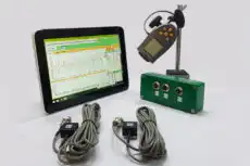
Ndani, chombo sawa kinachokamata taswira kawaida hupatia kumbukumbu ya kasi. Uchambuzi wenye mifumo miwili ya kubeba kama Balancet-1A, jamandishwe na kipimamasi kasi wa laser wenye koni kinachozunguka kanda ya bendera inayoakisi, kinarekoodi taswira zilizosawazishwa na amplitude-na-awamu 1× kulingana na kukimbia au kushuka — nyenzo mbichi ambayo muundo wa matangazo unakusanywa. Kwa sababu kipimo kinachukuliwa kwenye viunga vya mashine kwa kasi inayofanya kazi, muundo unaotokana unaonyesha tabia ya kweli ya rotor inayokaa.
5. Michoro Inayohusiana ya Kukimbia / Kushuka
Seti sawa ya data ya muda inapatia michoro kadhaa inayokomea, na wataalamu wenye uzamili wanakondoka kati yake kwa uhuru:
- Bode plot: amplitude na awamu ya agizo moja iliyochora kinyumunyumu kwa kasi kwenye mifumo ya Cartesian — mojawapo kwa kusoma RPM halisi ya kilele.
- Nyquist plot: kumbukumbu ya kweli-dhidi-ya-hayali ya vekta ya agizo moja, ambayo huunda kitanzi kila kasi muhimu.
- Campbell diagram: ramani inayohusiana ya mzunguko-dhidi-ya-kasi ambayo inasikiliza mistari ya agizo kwenye mistari ya mzunguko wa asili kulakabili kutokiana.
Ambapo michoro ya Bode na Nyquist inakamatia agizo moja kwa wakati, waterfall inabakiza entire taswira katika mtazamo kila kasi. Upana huo ni sababu nusu ni sababu inayoanza kwa muda mgeni na chombo kisicho na msaada kwa uchambuzi wa rotordynamic wenye kina, kinachoanika picha kamili ya tabia ya mashine katika eneo lake lote la uendeshaji.
