Understanding Cascade Plots

A cascade plot — அதை waterfall plot, முப்பரிமாண நிறமாலை, அல்லது நிறமாலை வரைபடம் — என்பது எவ்வாறு என்பதைக் காட்டும் ஒரு முப்பரிமாண காட்சி vibration அதிர்வன மூலம் அலைவரிசை நேரம், வேகம் அல்லது மற்றொரு மாறியுடன் மாறுகின்றன. அதிர்வெண் X-அச்சில் அமைகிறது, மாறும் மாறி (நேரம் அல்லது வேகம்) Y-அச்சில் அமைகிறது, மற்றும் அதிர்வு amplitude Z-அச்சில் அமைகிறது, உயரம், வண்ண தீவிரம் அல்லது இரண்டாகவும் வழங்கப்படுகிறது. தொடர்ச்சியான நிறமாலைகள் ஒரு தொடர் அருவி நீர்வீழ்ச்சிகளைப் போல ஒன்றின் பின் ஒன்றாக அடுக்கப்படுகின்றன, எந்த ஒரு 2D நிறமாலையாலும் வெளிப்படுத்த முடியாத வடிவங்களை வெளிப்படுத்தும் ஒரு படத்தை உருவாக்குகின்றன.
இந்த கூடுதல் பரிமாணம் கேஸ்கேட் வரைபடத்தை குறிப்பாக இரண்டு பணிகளுக்கு இன்றியமையாததாக ஆக்குகிறது: rotor dynamics analysis, where it pinpoints முக்கிய வேகங்கள் தொடக்கம் அல்லது நிறுத்தத்தின்போது, மற்றும் நீண்டகால கோளாறு கண்காணிப்பு, அங்கு ஒரு பொறியாளர் ஒரு தாங்கி குறைபாட்டு அதிர்வெண் முதலில் தோன்றி பின்னர் வளரும் தருணத்தை கவனிக்க முடியும். கேஸ்கேட் வரைபடம் மற்றும் அருவி வரைபடம் என்ற சொற்கள் இந்தத் துறை முழுவதும் ஒன்றுக்கொன்று மாற்றாகப் பயன்படுத்தப்படுகின்றன.
1. கேஸ்கேட் வரைபடம் எவ்வாறு உருவாக்கப்படுகிறது
Axes and Dimensions
- X-axis (horizontal): அதிர்வெண், Hz, CPM அல்லது orders.
- Y-axis (depth): சுழற்சி செய்யப்படும் மாறி — நேரம், வேகம் அல்லது சுமை.
- Z-axis (vertical or colour): vibration amplitude.
- Perspective: பொதுவாக முன்-மேல் கோணத்தில் பார்க்கப்படுகிறது, இதனால் அருகிலுள்ள தடங்கள் பின்னே உள்ளவற்றை முழுமையாக மறைக்காது.
Y-அச்சு மாறியின் அடிப்படையிலான வகைகள்
Y-அச்சு எதை குறிக்கிறது என்பது வரைபடத்தின் நோக்கத்தை வரையறுக்கிறது:
- Speed-based cascade (startup/coastdown): Y-அச்சு சுழல்வேகமாக இருக்கிறது, ஒரு run-up அல்லது coastdown, வேகம் பொதுவாக முன்னிலிருந்து பின்புறம் அதிகரிக்கும். இது கட்டுப்பாட்டு வேக அடையாளத்திற்கான மிகவும் பொதுவான வடிவமாகும்.
- Time-based cascade: Y-அச்சு நாட்காட்டி நேரமாக இருக்கிறது, நாட்கள், வாரங்கள் அல்லது மாதங்களில் கோளாறு வளர்ச்சியைக் காட்டுகிறது — சமீபத்திய பதிவுகள் பின்புறத்தில், பழையவை முன்புறத்தில் — இது முற்போக்கான தோல்விகளை கண்காணிக்க சிறந்தது.
- Load-based cascade: Y-அச்சு சுமை அல்லது சக்தியாக இருக்கிறது, அதிர்வு சுமையுக்கு எவ்வாறு பதிலளிக்கிறது என்பதை வெளிப்படுத்துகிறது மற்றும் மாறும் கடமை உபகரணங்களில் சுமை சார்ந்த நிகழ்வுகளை வெளிக்கொணர்கிறது.
2. கேஸ்கேட் வரைபடங்களை படிக்கவும் விளக்கவும்
முழு நுட்பமும் ஒரு காட்சி விதியில் தங்கியிருக்கிறது: தண்டு வேகத்தை பின்தொடரும் கூறுகள் மூலைவிட்டமாக சாய்கின்றன, அதிர்வெண்ணில் நிலையான கூறுகள் செங்குத்தாக நிற்கின்றன. அந்த வடிவியலைப் படிக்கக் கற்றுக்கொண்டால் வரைபடம் தன்னைத்தானே விளக்கிக்கொள்கிறது.
Speed-Tracking Components
இவை மூலைவிட்ட கோடுகளாக தோன்றுகின்றன, ஏனெனில் அவற்றின் அதிர்வெண் வேகத்துடன் உயர்கிறது மற்றும் குறைகிறது:
- 1× line: தொடக்கப் புள்ளியிலிருந்து நேரான மூலைவிட்டம் — இதன் சிறப்பியல்பு கையொப்பம் unbalance.
- 2× line: a steeper diagonal, commonly misalignment அல்லது looseness.
- Higher orders: இன்னும் செங்குத்தான மூலைவிட்டங்கள், harmonics இயக்க வேக.
Fixed-Frequency Components
இவை செங்குத்து கோடுகளாக தோன்றுகின்றன, வேகத்தைப் பொருட்படுத்தாமல் நிலையாக இருக்கின்றன:
- இயல்பான அதிர்வெண்கள்: vertical features marking structural resonances.
- Electrical frequencies: இரட்டை மின்கோடு அதிர்வெண் (60 Hz விநியோகத்தில் 120 Hz, 50 Hz விநியோகத்தில் 100 Hz) முற்றிலும் செங்குத்தாக நிற்கிறது.
- வெளிப்புற அதிர்வு: அருகிலுள்ள உபகரணங்களிலிருந்து உள்ளே வரும் நிலையான அதிர்வெண்கள்.
Identifying a Critical Speed
பலன் கிடைப்பது ஒரு மூலைவிட்ட 1× கோடு ஒரு செங்குத்து இயற்கை அதிர்வெண் அம்சத்தை கடக்கும் இடத்தில். அந்த குறுக்குவெட்டில் வீச்சு உச்சமடைகிறது — வரைபடத்தில் ஒரு “மலை” ஆக உயர்கிறது — ஏனெனில் சுழலி அதிர்வொத்திசைவு வழியாக இயக்கப்படுகிறது, மேலும் அந்த உச்சத்தின் கூர்மை damping.
3. Applications
Critical Speed Analysis
இது கமிஷனிங் மற்றும் பிழைத்திருத்தத்திற்கு மையமான பாரம்பரிய பயன்பாடாகும். வேக-அடிப்படையிலான அடுக்கு வரைபடம் ஒரு பொறியாளருக்கு இயக்க வரம்பில் உள்ள ஒவ்வொரு க்ரிட்டிகல் ஸ்பீட்டையும் கண்டறியவும், இயக்க வேகத்திலிருந்து பிரிப்பு வரம்புகளை சரிபார்க்கவும், சிகர கூர்மையிலிருந்து அணைப்பை மதிப்பிடவும், மற்றும் அளவிடப்பட்ட க்ரிட்டிகல் ஸ்பீட்களை ஒரு Campbell வரைபடம் or rotor model.
Bearing Defect Monitoring
நேர-அடிப்படையிலான அடுக்கு வரைபடம் சிதைவடைந்து வரும் ஒரு பேரிங்கை கண்காணிக்க இயல்பான வழியாகும்: பின்வருவதை கவனிக்கவும் BPFO, BPFI, and BSF சிகரங்கள் தோன்றி உயர்வதை கவனிக்கவும், முன்னேறும் சேதத்தை சமிக்ஞை செய்யும் ஹார்மோனிக் வளர்ச்சியை குறித்துக்கொள்ளவும், மற்றும் வளர்ச்சி வீதத்திலிருந்து தோல்வி காலக்கெடுவை மதிப்பிடவும் — இது கணிப்பதற்கான அடித்தளமாகும் மீதமுள்ள பயனுள்ள வாழ்க்கை.
Order Analysis
அதிர்வெண் அச்சை Hz க்கு பதிலாக ஆர்டர்களில் வரைவது வடிவியலை பயனுள்ள முறையில் மாற்றுகிறது: வேக-ஒத்திசைவு கூறுகள் செங்குத்தாக வரிசைப்படுத்தப்படும் அதே நேரத்தில் ஒத்திசைவற்றவை (பேரிங் டோன்கள் அல்லது oil whirl) மூலைவிட்ட கோட்டில் சாய்ந்து செல்கின்றன. இது மாறி-வேக இயந்திரங்களில் குறிப்பாக சக்திவாய்ந்தது, அங்கே மரபான Hz அச்சு ஒவ்வொரு ஆர்டரையும் ஒரு பட்டையாக பரப்பிவிடும்.
Fault Development Visualisation
மேலும் பொதுவாக, அடுக்கு வரைபடம் ஒரு தவறு உருவாவதை கண்காணிக்கும் தேர்ந்த வடிவமாகும் — புதிய சிகரங்கள் தோன்றுதல், இருக்கும் சிகரங்கள் வளர்தல், ஹார்மோனிக்கள் பெருகுதல், மற்றும் sidebands தோன்றுதல் — அனைத்தும் ஒரே படத்தில் விரிக்கப்பட்டுள்ளன.
4. Creating Effective Cascade Plots
Data Collection
- Sufficient slices: தெளிவான, படிக்கக்கூடிய மேற்பரப்பிற்கு குறைந்தது 10–20 ஸ்பெக்ட்ரம்கள் தேவை.
- Consistent increment: Y-அச்சு மாறியில் சீரான இடைவெளி வடிவியலை திரிபடையாமல் வைத்திருக்கும்.
- போதுமான பிரிதல் திறன்: ஆர்வமுள்ள சிகரங்களை பிரிக்கதக்க போதுமான அதிர்வெண் தெளிவுத்திறன் — இது FFT தெளிவாக்கம் கணக்கியல் can help make.
- Full range: முழுமையான இயக்க வேக வரம்பையோ அல்லது முழு போக்கு காலகட்டத்தையோ உள்ளடக்குங்கள், இதனால் முக்கியமான எதுவும் வரைபடத்திற்கு வெளியே விழாது.
Display Settings
- Amplitude scale: நேரியல் அல்லது லோகரித்மிக், தரவின் டைனமிக் வரம்பிற்கு ஏற்றவாறு தேர்ந்தெடுக்கப்பட்டது.
- Colour map: ஆர்வமுள்ள அம்சங்கள் தனித்து தெரியும்படி தேர்ந்தெடுக்கப்பட்டது.
- Perspective angle: தெளிவிற்காக பொதுவாக 20–30° உயரம்.
- சிகர தக்கவைப்பு: சில மென்பொருள்கள் படத்தை கூர்மைப்படுத்த துண்டுகள் முழுவதும் ஒரு சிகர உறை வரைகின்றன.
5. Where Field Instruments Fit
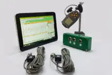
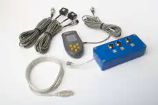
பயன்படுத்தக்கூடிய அடுக்கு வரைபடத்தை பதிவுசெய்ய, ஒரு ரன்-அப் அல்லது கோஸ்ட்டவுன் முழுவதும் ஷாஃப்ட் வேகத்துடன் ஒத்திசைக்கப்பட்ட ஒரு தொடர் ஸ்பெக்ட்ரம்களை பதிவுசெய்யக்கூடிய கருவி தேவை. இரட்டை-சேனல் கையடக்க அலசி போன்ற Balanset-1A ஒரு ஷாஃப்ட்டுடன் சேர்ந்து அதிர்வை அளவிடுகிறது tachometer குறிப்பு, எனவே ஒரு கள பொறியாளர் தனது சொந்த பேரிங்களில் உள்ள ஒரு இயந்திரத்தில் க்ரிட்டிகல் ஸ்பீட்டை கண்டறிய தேவையான வேக-குறிக்கப்பட்ட ஸ்பெக்ட்ரம்களை சேகரிக்கலாம் — பின்னர், மூலைவிட்ட 1× கோடு மேலோங்கினால், நேரடியாக field balancing தளத்தை விட்டு வெளியேறாமலேயே.
6. நன்மைகள் மற்றும் வரம்புகள்
எந்த ஒரு காட்சிப்படுத்தலையும் போலவே, அடுக்கு வரைபடம் ஒரு உலகளாவிய விடைக்கு பதிலாக வரையறுக்கப்பட்ட சிறந்த புள்ளியுடன் கூடிய கருவியாகும்.
Advantages
- பல பரிமாண தரவை உள்ளுணர்வுடன் கூடிய ஒரே காட்சியில் வழங்குகிறது.
- தனித்தனி 2D ஸ்பெக்ட்ரம்களில் தெரியாத வடிவங்களை வெளிப்படுத்துகிறது.
- வேக-சார்ந்த கூறுகளை வேக-சுயாதீன கூறுகளிலிருந்து தெளிவாக பிரிக்கிறது.
- இயக்கவியல் நடத்தையின் விரிவான படத்தை அளிக்கிறது — மேலும் அறிக்கைகள் மற்றும் விளக்கக்காட்சிகளில் நன்றாக வாசிக்கப்படுகிறது.
Limitations
- அதிகமான கூறுகள் இருக்கும்போது குழப்பமாக மாறலாம்.
- சரியாக விளக்கிக்கொள்ள அனுபவம் தேவைப்படுகிறது.
- 3D காட்சியில் நுண்ணிய விவரங்கள் அருகில் உள்ள சிகரங்களுக்கு பின்னால் மறைந்துவிடலாம்.
- துல்லியமான எண் மதிப்புகளை படிப்பதை கடினமாக்குகிறது, எனவே இது மரபான 2D ஐ மாற்றுவதற்கு பதிலாக நிரப்புகிறது நிறமாலை பகுப்பாய்வு.
அடுக்கு வரைபடங்கள் (cascade plots) சக்திவாய்ந்த காட்சிப்படுத்தல் கருவிகளாகும்; அவை நேர அல்லது வேக பரிமாணத்தை அதிர்வெண் பகுப்பாய்வில் சேர்த்து, நிலையான நிரல்படங்கள் கண்டறியாத இயக்கவியல் வடிவங்களையும் முன்னேற்றங்களையும் வெளிப்படுத்துகின்றன. அவற்றை விளக்கம் செய்வதில் தேர்ச்சி பெறுவது — மூலைவிட்ட மற்றும் செங்குத்து அம்சங்களை வேறுபடுத்துவது, நெருக்கடி வேகம் (critical speed) குறுக்கீட்டு புள்ளிகளைக் கண்டுபிடிப்பது, மற்றும் தோஷ முன்னேற்றத்தை கண்காணிப்பது — மேம்பட்ட அதிர்வு பகுப்பாய்வு மற்றும் சுழலி இயக்கவியல் மதிப்பீட்டிற்கான முக்கியமான திறனாகும்.
