Розуміння графіка Найквіста (полярного графіка)


A Діаграма Найквіста — широко відома як полярний графік у вібраційному аналізі — це графік, що відображає змінний вектор вібрації у полярній системі координат. На відміну від Діаграма Боде, що поширюється амплітуда і фаза на двох окремих декартових графіках, графік Найквіста об'єднує обидва в одному зображенні. Відстань від початку координат — це амплітуда вібрації, а кут навколо графіка — її фазовий кут, тому кожна точка на кривій є одним повним вектором вібрації.
1. Визначення: амплітуда та фаза на одній діаграмі
Графік відображає траєкторію, яку описує кінець вектора 1× (синхронного) вібрації в міру зміни швидкості машини — зазвичай під час пуску або вибігу. Швидкість позначається вздовж кривої змінними кольорами або символами, тому аналітик може зчитувати не лише величину та напрям вектора, а й оберти за хвилину, при яких була зафіксована кожна точка.
- The відстань від початку координат (центру) відображає амплітуду вібрації — чим далі від центру, тим більша реакція.
- The кут навколо ділянки represents the фазовий кут вібрації відносно тахометр reference.
Оскільки обидві осі описують один обертовий компонент, діаграма Найквіста сприймається як годограф вектора, а не як пара трендових ліній, і саме ця компактність робить її настільки інформативною поблизу резонансу.
2. Чому діаграма Найквіста є важливою?
Діаграма Найквіста забезпечує унікально компактний вигляд динамічної реакції машини. Її основне призначення, як і у діаграми Боде, — визначення та аналіз критичні швидкості — це резонанси системи ротор–підшипник.
Класичним показником критичної швидкості на графіку Найквіста є петля. У міру наближення швидкості до власна частота, амплітуда зростає і крива відходить від початку координат. Коли швидкість проходить через критичну, фаза зазнає зсуву на 180 градусів, переміщуючи кінець вектора по колу або петлі. Точка максимальної амплітуди знаходиться у верхній частині петлі, а сама критична швидкість відповідає точці зсуву фази на 90 градусів на петлі — значно більш очевидний орієнтир, ніж поступова зміна фази на діаграмі Боде.
3. Інтерпретація діаграми Найквіста
Форма, розмір і орієнтація петлі містять велику кількість діагностичної інформації про стан ротора та його динамічні характеристики.
- Демпфування: діаметр петлі обернено пропорційний до демпфування. Велике, добре сформоване коло свідчить про низьке демпфування та високе підсилення; мала, щільна петля вказує на добре демпфовану систему.
- Анізотропія (розщеплення критичних частот): якщо роторна система має різну жорсткість у горизонтальному та вертикальному напрямках, графік може показувати дві чіткі, що перекриваються петлі — виражене “розщеплення критичної швидкості”, спричинене напрямною жорсткість.
- Визначення положення важкого місця: орієнтація петлі допомагає визначити місце важкої точки ротора — дисбаланс — відносно позначки фазового відліку на валу, що вказує місце встановлення коригувальний вантаж should go.
- Зміни в системі: порівняння діаграм Найквіста в часі виявляє зміни в технічному стані машини. Зміна розміру або форми петлі сигналізує про зміну демпфування або жорсткості, що може вказувати на тріснутий ротор, a loose фундамент, або зміну характеристик підшипника в динаміці.
- Балансування: графік використовується в розширеному flexible-rotor балансуванні. Спостерігаючи за тим, як переміщується петля після додавання пробний вантаж аналітик визначає коефіцієнти впливу необхідних для обчислення рішення щодо балансування.
4. Збір даних у польових умовах
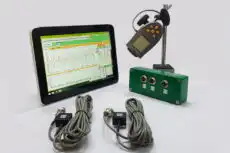
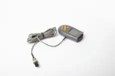
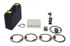
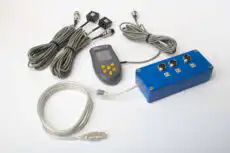
Діаграма Найквіста настільки точна, наскільки якісні синхронізовані дані амплітуди та фази, що лежать в її основі, а ці дані залежать від чіткого сигналу фазового орієнтиру, знятого один раз за оберт під час розгону. У польових умовах портативний двоканальний аналізатор вібрацій, наприклад Balanset-1A вимірює амплітуду та фазу 1× відносно імпульсу оптичного тахометра під час розбіг або вибіг, забезпечуючи запис вектора залежно від швидкості, за яким будується полярний графік. Те саме вимірювання амплітуди та фази лежить в основі балансування на місці, тому один прилад одночасно характеризує резонанс і усуває дисбаланс, що його збуджує. Щоб перевірити, чи перетне лінія оборотної частоти власну частоту в межах робочого діапазону, аналітик може попередньо побудувати діаграму інтерференції за допомогою Калькулятор діаграми Кемпбелла.
5. Діаграма Найквіста vs діаграма Боде
Діаграми Найквіста і Боде відображають однакові дані — амплітуду та фазу 1× залежно від швидкості — у різних форматах, і вибір між ними часто визначається уподобаннями аналітика та характеристикою, яку необхідно підкреслити.
- Bode plot: краще підходить для зчитування точних обертів за хвилину при пиковій амплітуді та точного початку й кінця зсуву фази на 180 градусів, оскільки його вісь швидкості лінійна й легко масштабується.
- Nyquist plot: краще підходить для сприйняття всієї динамічної характеристики одразу. Він чудово показує рівень демпфування через розмір петлі та виявляє роздвоєні критичні частоти у вигляді петель, що перекриваються, — обидва аспекти сприймаються інтуїтивніше, ніж на діаграмі Боде.
Тісно пов'язаним відображенням є орбіта вала, який відображає рух у площині підшипника, а не окремий вектор залежно від швидкості. Більшість сучасних аналізатори вібрації може будувати всі три, і досвідчені аналітики використовують їх разом для комплексного динаміка ротора diagnosis.