Nyquist Plot (Polar Plot) అర్థం చేసుకోవడం


ఎ Nyquist plot — విస్తృతంగా అని పిలవబడే polar plot vibration పనిలో — ఒక polar coordinate system పై మారుతున్న vibration vector ని ప్రదర్శించే గ్రాఫ్. ఒక Bode plot, ఇది వ్యాపిస్తుంది amplitude and phase రెండు వేర్వేరు Cartesian గ్రాఫ్లలో వ్యాపించి ఉండటంతో భిన్నంగా, Nyquist plot రెండింటినీ ఒకే చిత్రంలో అమర్చుతుంది. origin నుండి దూరం vibration యొక్క amplitude, మరియు plot చుట్టూ ఉన్న కోణం దాని phase angle, కాబట్టి వక్రరేఖపై ప్రతి బిందువు ఒక పూర్ణ vibration vector.
1. నిర్వచనం: ఒకే diagram పై Amplitude మరియు Phase
యంత్రం యొక్క వేగం మారుతున్నప్పుడు, సాధారణంగా startup లేదా shutdown సమయంలో, 1× (synchronous) vibration vector యొక్క tip చేసే మార్గాన్ని plot గుర్తిస్తుంది. వేగాన్ని వక్రరేఖపై మారుతున్న రంగులు లేదా చిహ్నాలతో సూచిస్తారు, కాబట్టి విశ్లేషకుడు vector యొక్క పరిమాణం మరియు దిశను మాత్రమే కాకుండా, ప్రతి బిందువు నమోదైన RPM కూడా చదవగలరు.
- The origin నుండి దూరం (కేంద్రం) vibration యొక్క amplitude ని సూచిస్తుంది — బయటికి వెళ్ళిన కొద్దీ, ప్రతిస్పందన పెద్దదిగా ఉంటుంది.
- The ప్లాట్లో కోణం చుట్టూ represents the phase angle vibration యొక్క phase angle, దానికి సంబంధించి tachometer reference.
రెండు అక్షాలూ ఒకే తిరిగే భాగాన్ని వివరిస్తాయి కాబట్టి, Nyquist plot ను రెండు trend రేఖల జంటగా కాకుండా ఒక vector యొక్క locus గా చదువుతారు, మరియు అదే సంపీడనత resonance సమీపంలో దీన్ని అంత బహిర్గతంగా చేస్తుంది.
2. Nyquist Plot ఎందుకు ముఖ్యమైనది?
Nyquist plot ఒక యంత్రం యొక్క dynamic ప్రతిస్పందనపై ప్రత్యేకంగా సంపీడిత దృష్టిని అందిస్తుంది. దాని ప్రాథమిక ప్రయోజనం, Bode plot వలె, గుర్తించడం మరియు విశ్లేషించడం క్రిటికల్ స్పీడ్లు — the resonances rotor-bearing వ్యవస్థ యొక్క.
Nyquist plot పై critical speed యొక్క క్లాసిక్ సూచిక ఒక loop. వేగం దగ్గరపడుతున్నప్పుడు స్వాభావిక పౌనఃపున్యం, amplitude పెరుగుతుంది మరియు వక్రరేఖ origin నుండి దూరంగా కదులుతుంది. వేగం critical speed గుండా వెళ్ళేటప్పుడు, phase 180 డిగ్రీల మార్పుకు లోనవుతుంది, vector tip ని ఒక వృత్తం లేదా loop ఏర్పడేలా తిప్పుతుంది. గరిష్ట amplitude యొక్క బిందువు loop పైభాగంలో ఉంటుంది, మరియు critical speed అనేది loop పై 90-డిగ్రీల phase-shift బిందువులో ఉంటుంది — ఇది Bode plot పై క్రమంగా phase ramp కంటే చాలా స్పష్టమైన మైలురాయి.
3. నైక్విస్ట్ ప్లాట్ను అర్థం చేసుకోవడం
loop యొక్క ఆకారం, పరిమాణం మరియు ధోరణి rotor యొక్క ఆరోగ్యం మరియు dynamic లక్షణాల గురించి చాలా diagnostic సమాచారాన్ని కలిగి ఉంటాయి.
- Damping: loop యొక్క వ్యాసం వ్యవస్థ యొక్క damping కు విలోమంగా సంబంధం కలిగి ఉంటుంది damping. పెద్ద, బాగా ఏర్పడిన వృత్తం తక్కువ damping మరియు అధిక amplification ను సూచిస్తుంది; చిన్న, బిగుతైన loop బాగా damped వ్యవస్థను సూచిస్తుంది.
- అనిసోట్రోపీ (విభజిత క్రిటికల్ వేగాలు): rotor వ్యవస్థ క్షితిజ సమాంతర మరియు నిలువు దిశలలో వేర్వేరు stiffness కలిగి ఉంటే, plot రెండు విభిన్న, అతివ్యాప్త loops ను చూపవచ్చు — దిశాత్మక stiffness వల్ల కలిగే స్పష్టమైన “split critical” stiffness.
- హెవీ-స్పాట్ స్థానం: loop యొక్క ధోరణి rotor యొక్క heavy spot — అంటే unbalance — shaft పై phase reference mark కు సంబంధించి గుర్తించడంలో సహాయపడుతుంది, ఇది ఒక correction weight ను correction weight should go.
- సిస్టమ్ మార్పులు: కాలక్రమేణా Nyquist plots ను పోల్చడం యంత్ర స్థితిలో మార్పులను బహిర్గతం చేస్తుంది. loop పరిమాణం లేదా ఆకారంలో మార్పు damping లేదా stiffness లో మార్పును సూచిస్తుంది, ఇది ఒక cracked rotor, a loose foundation, లేదా మారుతున్న బేరింగ్ లక్షణాలు.
- Balancing: plot ని అధునాతన flexible-rotor balancing లో ఉపయోగిస్తారు. ఒక trial weight జోడించిన తర్వాత loop ఎలా కదులుతుందో గమనించడం ద్వారా, ఒక విశ్లేషకుడు trial weight ను పొందుతాడు ఇన్ఫ్లుయెన్స్ కోఎఫిషియెంట్లు balancing పరిష్కారాన్ని గణించడానికి అవసరమైన influence coefficient ని.
4. క్షేత్రంలో డేటా సేకరించడం
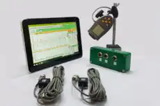
Nyquist plot అనేది దాని వెనుక ఉన్న సమకాలీకృత amplitude-and-phase డేటాపై ఆధారపడి ఉంటుంది, మరియు ఆ డేటా స్పీడ్ స్వీప్ సమయంలో తీసుకున్న శుభ్రమైన once-per-revolution phase రెఫరెన్స్పై ఆధారపడి ఉంటుంది. ఫీల్డ్లో, అటువంటి Balanset-1A optical-tachometer పల్స్కు వ్యతిరేకంగా 1× amplitude మరియు phase ని కొలుస్తుంది run-up or coast-down, polar plot గీయడానికి ఉపయోగించే వెక్టర్-వర్సెస్-స్పీడ్ రికార్డ్ను అందిస్తూ. అదే amplitude-and-phase కొలత field balancing, కాబట్టి ఒకే పరికరం resonance ని characterise చేయడంతో పాటు దానిని ప్రేరేపించే unbalance ని కూడా సరి చేస్తుంది. ఒక order line అనేది ఆపరేటింగ్ రేంజ్లో natural frequency ని దాటుతుందో లేదో తనిఖీ చేయడానికి, ఒక విశ్లేషకుడు ముందుగా Campbell diagram calculator.
5. Nyquist Plot vs Bode Plot
Nyquist మరియు Bode plots ఒకే డేటాను ప్రదర్శిస్తాయి — వేర్వేరు ఫార్మాట్లలో 1× amplitude మరియు phase వర్సెస్ స్పీడ్ — మరియు వాటి మధ్య ఎంపిక తరచుగా విశ్లేషకుని ప్రాధాన్యత మరియు నొక్కిచెప్పబడుతున్న లక్షణంపై ఆధారపడి ఉంటుంది.
- Bode plot: peak amplitude యొక్క ఖచ్చితమైన RPM మరియు 180-డిగ్రీ phase shift యొక్క ఖచ్చితమైన ప్రారంభం మరియు ముగింపు చదవడానికి మరింత అనుకూలంగా ఉంటుంది, ఎందుకంటే దాని స్పీడ్ యాక్సిస్ linear మరియు స్కేల్ చేయడానికి సులభంగా ఉంటుంది.
- Nyquist plot: మొత్తం dynamic response ని ఒకేసారి గ్రహించడానికి మరింత అనుకూలంగా ఉంటుంది. loop పరిమాణం ద్వారా damping మొత్తాన్ని చూపించడంలో మరియు overlapping loops గా split criticals ని బయటపెట్టడంలో ఇది రాణిస్తుంది, రెండూ Bode plot కంటే మరింత అర్థవంతంగా ఉంటాయి.
దగ్గరగా సంబంధించిన మరొక display ఏమిటంటే shaft orbit, ఇది ఒకే vector వర్సెస్ స్పీడ్కు బదులుగా bearing plane లో motion ని plot చేస్తుంది. చాలా ఆధునిక కంపన విశ్లేషకాలు మూడింటినీ గీయగలదు, మరియు అనుభవజ్ఞులైన విశ్లేషకులు సమగ్రమైన rotor-dynamics diagnosis.
