Understanding Polar Plots in Rotor Balancing


A polar plot (also called a polar diagram, and closely related to the Nyquist diagram used elsewhere in vibration work) is a circular graph that displays vibration data as vectors. Each vector carries two pieces of information at once: the amplitude (magnitude) and the phase angle (direction) of the vibration at a chosen measurement point. The radial distance from the centre encodes amplitude; the angular position around the circle encodes phase.
Polar plots are an essential visualisation tool in field balancing because they let a technician see at a glance how the vibration vectors shift through the balancing run and perform graphical vector addition and subtraction by eye — turning the otherwise abstract mathematics of rotor balancing into a picture.
1. How to Read a Polar Plot
Understanding the anatomy of the diagram is the first step to using it effectively.
The Coordinate System
- Origin (centre point): represents zero vibration. The closer a vector tip lies to the centre, the lower the amplitude — so the goal of every balancing job is to drive the vector toward the middle.
- Radial distance: the length of a vector from the origin is its amplitude. Concentric circles mark the amplitude scale, for example 1, 2, and 3 mm/s.
- Angular position: the angle of a vector is its phase. By convention 0° sits at the right (the 3 o’clock position) and angles increase counter-clockwise — 90° at the top, 180° at the left, 270° at the bottom.
- Phase reference: the phase angle is always measured against a once-per-revolution mark on the rotor, sensed by a tachometer or keyphasor. Without that reference pulse, phase — and therefore the whole plot — has no meaning.
Reading Vector Data
Each vector on the diagram is a complete description of the vibration at one condition:
- A vector pointing at 45° with a length of 5 mm/s means vibration of 5 mm/s amplitude occurring 45° after the reference mark passes the sensor.
- Several vectors can share one diagram, so the entire history of a balancing job — before, during, and after correction — is visible on a single chart.
A vector is shorthand for a sinusoid: its length is the peak amplitude of the 1× running-speed response, and its angle is the timing of that response relative to the shaft reference.
2. Using Polar Plots Through a Balancing Procedure
The diagram comes into its own as a step-by-step record of the work.
Plotting the Initial Vibration
The first vector represents the initial unbalance condition. This “O” vector (for “Original”) fixes both the magnitude and the angular location of the unbalance-induced vibration — the starting point everything else is measured from.
Adding the Trial-Weight Effect
When a trial weight is fitted and a test run is performed, a second vector “O+T” is plotted, representing the combined effect of the original unbalance plus the trial weight. By subtracting one from the other (O+T − O), the isolated effect of the trial weight “T” appears as its own vector. That trial-weight effect vector is, in essence, a graphical form of the influence coefficient for the plane.
Calculating the Correction Weight
The required correction weight is the one that produces a vibration vector exactly opposite (a 180° phase shift) and equal in magnitude to the original “O”. When that opposing vector is added to O, the sum lands at or near the origin — zero vibration. The polar plot makes this cancellation visually obvious in a way a table of numbers never can.
Verification
After the correction weight is installed, a final verification run produces a new vector on the same diagram. If the job succeeded, this residual vector sits very close to the origin, confirming low residual unbalance.
3. Vector Addition on the Polar Plot
One of the most useful features of the polar plot is that vectors can be combined graphically with the “tip-to-tail” method:
- To add two vectors, place the tail of the second at the tip of the first.
- The resultant runs from the tail of the first vector to the tip of the second.
- This lets a technician visualise instantly how separate unbalance sources combine — or cancel.
Vector subtraction is simply addition in reverse: flip the vector being subtracted through 180° and add it to the other. This is exactly the operation used to isolate the trial-weight effect, and it underpins the arithmetic of single-plane balancing. For the two-plane case the same geometry is applied to each plane, with the cross-effects handled by the Influence Coefficient Calculator.
4. Why the Visualisation Matters
Beyond the mathematics, the polar plot earns its place for several practical reasons:
- Intuitive representation: a circular format naturally suits a rotational phenomenon, making the angular relationship between unbalance and correction easy to grasp.
- Complete information: amplitude and phase live in one compact diagram, with no need for separate charts.
- Visual quality check: data-collection errors often jump out immediately. If a trial weight produces almost no change, the two vectors overlap — a clear sign the weight was too small or the system is misbehaving.
- Documentation: a well-labelled polar plot is an excellent record, showing the full progression from initial unbalance to corrected state for a diagnostic report.
- Troubleshooting: when balancing misbehaves, the plot can expose non-linear system response, a soft foot, or measurement error before more time is wasted.
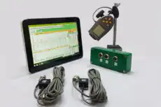
5. Polar Plots on Modern Balancing Instruments
Contemporary portable balancers and software draw the polar plot in real time as the job proceeds. The instrument:
- plots each measurement automatically as a vector;
- performs all the vector mathematics internally;
- shows the graphical plot and the numerical results side by side;
- lets the technician zoom, pan, and annotate for documentation.
A field instrument such as the Balanset-1A illustrates the workflow well: as each run completes, it places the O, O+T, and trim vectors on screen, derives the influence coefficient automatically, and presents the correction mass and angle ready to apply — while the live polar display lets the operator confirm at a glance that each step is pulling the vector toward the centre. Used this way on a portable analyser, the plot is both a working tool and a sanity check.
Despite all this automation, the ability to read and interpret a polar plot remains an essential skill. It reveals the underlying physics, lets an engineer sanity-check the instrument’s numbers, and turns a black-box result into something a human can trust and explain.