Ротор теңгеруіндегі полярлық графиктерді түсіну

A polar plot (сонымен қатар полярлық диаграмма деп аталады және тербеліс жұмысында басқа жерде қолданылатын Nyquist диаграммасымен тығыз байланысты) — тербеліс деректерін векторлар ретінде бейнелейтін шеңберлі график. vibration деректерін векторлар ретінде бейнелейді. Әрбір вектор бір мезгілде екі ақпарат алып жүреді: amplitude (амплитуда) және phase angle (бағыты) таңдалған өлшеу нүктесіндегі тербелістің. Орталықтан радиалдық қашықтық амплитуданы кодтайды; шеңбер бойындағы бұрыштық орын фазаны кодтайды.
Полярлық диаграммалар мынада маңызды визуализация құралы болып табылады: field balancing өйткені олар техникке балансировка жүргізу барысында тербеліс векторларының қалай өзгеретінін бір қарауда бағалауға және графикалық вектор қосындысы және алуды көзбен орындауға — әйтпесе абстрактілі математиканы rotor balancing суретке айналдыруға мүмкіндік береді.
1. Полярлық диаграмманы қалай оқу керек
Диаграмманың құрылымын түсіну оны тиімді пайдаланудың бірінші қадамы болып табылады.
Координаталар жүйесі
- Бастау нүктесі (орталық нүкте): нөлдік тербелісті білдіреді. Вектор ұшының орталыққа жақындығы амплитуданың төмендігін көрсетеді — сондықтан кез келген балансировка жұмысының мақсаты векторды ортаға қарай жылжыту болып табылады.
- Радиалдық қашықтық: бастау нүктесінен вектордың ұзындығы оның амплитудасы болып табылады. Концентрлік шеңберлер амплитуда шкаласын белгілейді, мысалы 1, 2 және 3 мм/с.
- Бұрыштық орын: the angle of a vector is its phase. By convention 0° sits at the right (the 3 o’clock position) and angles increase counter-clockwise — 90° at the top, 180° at the left, 270° at the bottom.
- Фаза сілтемесі: фаза бұрышы әрқашан роторда айналымға бір рет белгіленетін таңбаға қатысты өлшенеді, оны tachometer or keyphasor. Осы анықтамалық импульссіз фазаның — демек бүкіл диаграмманың — ешқандай мәні болмайды.
Вектор деректерін оқу
Диаграммадағы әрбір вектор бір жағдайдағы тербелісті толық сипаттайды:
- A vector pointing at 45° with a length of 5 mm/s means vibration of 5 mm/s amplitude occurring 45° after the reference mark passes the sensor.
- Бір диаграммада бірнеше вектор орналаса алады, сондықтан балансировка жұмысының бүкіл тарихы — түзетуге дейін, кезінде және одан кейін — бір кестеде көрінеді.
Вектор синусоиданың қысқаша белгісі болып табылады: оның ұзындығы 1× жұмыс жылдамдығы жауап, ал оның бұрышы — сол жауаптың білік анықтамасына қатысты уақыттық сипаттамасы.
2. Теңгеру процедурасы барысында полярлық диаграммаларды пайдалану
Диаграмма жұмысты кезең-кезең бойынша тіркейтін құрал ретінде толық мәнін ашады.
Бастапқы тербелісті салу
Бірінші вектор бастапқы unbalance жағдайды білдіреді. Бұл “O” векторы (“Original” — “Бастапқы” сөзінен) теңгерімсіздік тудырған тербелістің шамасын да, бұрыштық орнын да анықтайды — қалған барлық өлшемдер осы бастапқы нүктеден жүргізіледі.
Сынақ салмағының әсерін қосу
When a trial weight орнатылады және test run орындалады, бастапқы теңгерімсіздік пен сынақ салмағының жиынтық әсерін білдіретін екінші “O+T” векторы салынады. Бірін екіншісінен алып тастау арқылы (O+T − O) сынақ салмағының жекелеген әсері “T” жеке вектор ретінде көрінеді. Бұл сынақ салмағы әсерінің векторы, мәні жағынан, influence coefficient for the plane.
Түзету салмағын есептеу
The required түзету салмағы бастапқы “O” векторымен дәл қарама-қарсы (фазасы 180° ауысқан) және оған тең шамалы тербеліс векторын береді. Бұл қарсы вектор O-ға қосылғанда қосынды нөлге жуықтайды — тербеліс жойылады. Полярлық диаграмма бұл өтелуді сандар кестесі ешқашан бере алмайтын көрнекі түрде анық көрсетеді.
Verification
Түзету салмағы орнатылғаннан кейін соңғы тексеру жүрісі сол диаграммада жаңа вектор береді. Жұмыс сәтті болса, бұл қалдық вектор бастапқы нүктеге өте жақын орналасып, төмен қалдық дисбалансы.
3. Полярлық диаграммадағы векторлық қосу
Полярлық диаграмманың ең пайдалы ерекшеліктерінің бірі — векторларды “ұш-құйрық” әдісімен графикалық тұрғыда біріктіруге болатындығы:
- Екі векторды қосу үшін екіншісінің құйрығын біріншісінің ұшына орналастырыңыз.
- Нәтиже векторы бірінші вектордың құйрығынан екіншісінің ұшына дейін созылады.
- Бұл технологқа жекелеген теңгерімсіздік көздерінің қалай біріктірілетінін — немесе өзара өтелетінін — бірден көзбен бағалауға мүмкіндік береді.
Векторлық алу — бұл кері қосу: алынатын векторды 180° айналдырып, екіншісіне қосыңыз. Бұл сынақ салмағының әсерін жекелеп анықтауда қолданылатын операция болып табылады және бір жазықтықтағы балансировка. Екі жазықтықтағы жағдайда бірдей геометрия әр теңгеру жазықтығына қолданылады, ал өзара әсерлер Әсер Коэффициентін есептеу құралы.
4. Визуализацияның маңыздылығы
Математикадан тыс, полярлық диаграмма бірнеше практикалық себептер бойынша өз орнын иеленеді:
- Интуитивті бейнелеу: дөңгелек формат айналмалы құбылысқа табиғи түрде сәйкес келеді, бұл теңгерімсіздік пен түзету арасындағы бұрыштық қатынасты оңай түсінуге мүмкіндік береді.
- Толық ақпарат: амплитуда мен фаза бір ықшам диаграммада орналасқан, бөлек кестелерге қажеттілік жоқ.
- Көрнекі сапа тексеруі: деректер жинаудағы қателер көбінесе бірден байқалады. Егер сынақ салмағы іс жүзінде ешқандай өзгеріс тудырмаса, екі вектор қабаттасады — бұл салмақтың тым кіші екендігінің немесе жүйенің дұрыс жұмыс істемейтінінің анық белгісі.
- Documentation: жақсы белгіленген полярлық диаграмма бастапқы теңгерімсіздіктен түзетілген күйге дейінгі толық ілгерілеуді көрсетіп, тамаша жазба болып табылады диагностикалық есепке ұсынылған пайдалы жазба.
- Troubleshooting: теңгерімдеу нашар жүргенде, диаграмма жүйенің сызықтық емес жауабын, soft foot, немесе уақытты ысырап еткенге дейін өлшеу қатесін анықтауы мүмкін.
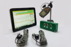
5. Заманауи теңгерімдеу аспаптарындағы полярлық диаграммалар
Заманауи портативті теңгерімдеу аспаптары мен бағдарламалық жасақтама жұмыс барысында полярлық диаграмманы нақты уақытта салады. Аспап:
- әрбір өлшемді автоматты түрде вектор ретінде белгілейді;
- барлық вектор есептеулерін ішкі жүйеде орындайды;
- графикалық диаграмма мен сандық нәтижелерді қатар көрсетеді;
- техникке құжаттау үшін масштабтауға, жылжытуға және аңдатпалар қосуға мүмкіндік береді.
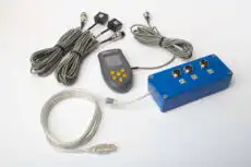
Мысалы, Балансет-1А сияқты далалық аспап жұмыс процесін жақсы суреттейді: әрбір өлшеу аяқталған сайын O, O+T және реттеу векторларын экранға орналастырады, әсер коэффициентін автоматты түрде есептейді және қолдануға дайын түзету массасы мен бұрышын ұсынады — ал нақты уақыттағы полярлық дисплей операторға әрбір қадамның векторды ортаға жақындатып жатқанын бір қарауда растауға мүмкіндік береді. Осылай ішінде анализатордиаграмма да жұмыс құралы, да тексеру тәсілі болып табылады.
Осы автоматтандырудың бәріне қарамастан, полярлық диаграмманы оқып, түсіндіру мүмкіндігі маңызды дағды болып қала береді. Ол негізгі физиканы ашады, инженерге аспаптың’ сандарын тексеруге мүмкіндік береді және «қара жәшік» нәтижесін адам сенім арта алатын және түсіндіре алатын нәрсеге айналдырады.
